
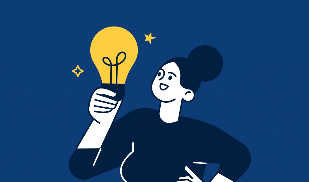
The Top Web Design Trends for Small Businesses in 2025: Or How to Avoid Looking Like It’s Still 2005
Every year it feels like web design trends multiply faster than the tabs I forget to close. If you’re a small business owner hoping to keep your website fresh and friendly for 2025, knowing what’s in (and what’s very much out) has never been more important. My inbox knows no rest from offers to “revamp” my site, but I know most of us just want the essentials without the overwhelm.
Whether it’s bolder colours, minimalist layouts, or AI-powered chat widgets with a questionable sense of humour, I’m keeping an eye on trends that flatter small businesses rather than drown them in unnecessary complexity. Let’s steer clear of design disasters and focus on what actually works.
Why Web Design Trends Matter for Small Businesses
Let’s face it: trying to grow a small business today without a decent website is a bit like shouting into the void with a paper megaphone. The way my website looks and functions can decide whether visitors stick around, click something, or run off faster than I do when someone mentions “mandatory team-building”. Trends in web design have a huge impact, from how customers feel using my site, to whether they remember my brand after closing the tab.
Impact on User Experience
If my website feels like it was made last century, chances are customers won't stick around. They want sites that load quickly, look tidy, and behave the same whether they're on a phone, tablet, or laptop that’s older than their dog.
New design trends, like dark mode or subtle animations, don’t just look cool—they make navigating my site much less painful. A great user experience means pages are responsive, menus make sense, and forms don’t ask for my favourite ice cream flavour before letting me sign up.
Here’s what I focus on:
- Mobile responsiveness: My site should work on everything from tiny phones to kitchen smart screens.
- Fast loading times: If I can make a cup of tea while waiting for my homepage, something’s gone wrong.
- Clarity: Clean layouts and easy navigation keep visitors from getting lost.
Driving User Engagement
I want people to actually do something on my site, not just admire my quirky logo and leave. This is where web design trends become my secret weapon.
Modern trends like micro-interactions (tiny visual feedback when users click or scroll) encourage clicks and keep visitors interested. For example, well-placed call-to-action buttons or eye-catching visuals help guide users towards signing up to my newsletter or buying something.
Here’s why this works:
- Clear prompts: Bold buttons and direct language stop visitors from wondering what to do next.
- Interactive elements: Subtle animations or hover effects make using my site feel more alive.
- Content hierarchy: Smart use of headings, lists, or even a lovely table, helps people find what they need before their tea gets cold.
Brand Identity in 2025
In 2025, a powerful brand identity depends on more than just a snazzy logo and a questionable tagline. The latest design trends let me express what makes my business unique, even if I sell something as unglamorous as plumbing supplies.
Consistent use of colours, typography, and imagery helps visitors instantly recognise my brand the next time they see it—whether online or in the wild. If I follow contemporary design cues, I can look as fresh and trustworthy as the big names, without spending my entire marketing budget on web designers.
What matters most to me:
- Consistent visual style: My web pages echo the same colour scheme, fonts, and tone.
- Personal touches: A fun mascot or a signature greeting, woven into the design, helps my brand stand out.
- Trustworthiness: Modern, uncluttered layouts signal that I care about professionalism (and that I'm not a scam artist working out of a secret lair).
Minimalism Meets Maximal Impact
A clean, minimalist approach might seem like a snooze-fest, but trust me—done right, it grabs attention faster than a cat on a laser pointer. By cleverly wielding white space and making typography the star, I can craft sites that feel modern, punchy, and easy on the eye.
Minimalist Design Principles
When I talk minimalism, I don’t mean “delete everything and hope for the best”. Key features include stripping away clutter, using plenty of breathing room, and making sure every element has a distinct purpose. I'm not here to build a digital jigsaw puzzle—navigation should be straightforward, not a round of Sherlock Holmes.
I focus on a subtle colour palette and limit decorative flourishes. Buttons and call-to-actions pop because they’re not smothered by unnecessary graphics. Less is genuinely more—except with biscuits.
Using a design grid, I keep layouts tidy and consistent, avoiding any wild west vibes. Minimalism works because it gives users exactly what they need, and nothing more, like a good cup of tea with precisely one sugar.
White Space: Not Just Dead Air
White space is my secret weapon. While some might see it as wasted space, for me, it’s a way to let every part of the site breathe. It stops text and images cramming together like commuters on the London Tube at rush hour.
Here’s how I make the most of it:
- Increased readability: Generous margins and padding mean users aren’t squinting at microscopic buttons.
- Highlighting key elements: Clever spacing draws the eye to what matters—call-to-action, contact form, or my fabulously witty logo.
- Mobile-friendly designs: On smaller screens, white space prevents the infamous “fat finger” incidents.
Rather than making a site look sparse, white space brings elegance and calm to even the busiest small business page.
Striking the Balance with Bold Typography
Forget dull fonts—typography can be a real showstopper. I mix custom fonts, playful serif fonts, and “look at me” headers to create visual hierarchy and guide the user through a site with style.
Bold typography isn’t just for shouting—it's brilliant for clarity. Using large, readable headlines ensures people know where they are, even if their coffee hasn’t kicked in yet. I keep line lengths reasonable and always pair fonts with care, so things don’t turn into a typographical roller-coaster.
For added flair, I sometimes highlight keywords in bold or italic, creating a rhythm that stops scrollers in their tracks. It’s the difference between a mumble and a perfectly delivered punchline—memorable, direct, and just a tad cheeky.
Vibrant Visuals and Stunning Typography
Let’s face it—I judge a website faster than I judge my morning tea’s strength. Visual appeal is everything, and in 2025, it’s all about bold colour, memorable type, and graphics that are more fun than a cat meme in an office Slack channel.
Vibrant Colour Palettes and High-Contrast Designs
Nothing grabs my attention like a vibrant palette and dramatic high-contrast design. These days, small businesses are stepping away from bland beige and jumping headfirst into bold greens, electric blues, hot pinks, and zesty oranges. I’m all for a website that shouts its personality from the digital rooftops (in a tastefully loud way, of course).
High-contrast designs aren’t just for style—they also help my eyes quickly find important bits. The white text on deep blue panels, call-to-action buttons in neon yellow, and black borders all make navigation friendlier for everyone, including folks with visual impairments. If I have to hunt for a button, I’m probably leaving—and taking my wallet with me.
Here’s a quick comparison:
| Old School Pastels | 2025’s Vibrant Palettes |
|---|---|
| Pale peach | Electric coral |
| Muted grey | High-contrast midnight blue |
| Powder blue | Neon cyan |
Custom Illustrations and Organic Shapes
Stock photos with the same grinning handshake? Not for me, thanks. I prefer sites with custom illustrations and quirky, organic shapes. Besides, nothing says “small business with big personality” quite like a charming little doodle of your signature coffee mug or a hand-drawn loaf of bread.
Organic shapes break up the grid and make layouts feel less robotic. Irregular blobs, squiggly lines, and wavy dividers add a human touch that a rectangle could only dream of achieving. I find they inject life and movement, creating a look that’s as distinct as my own questionable handwriting.
Small changes—like swappable backgrounds or animated SVG graphics—mean a site can stay fresh without a full redesign. I appreciate a little surprise every time I visit.
Creative Use of Typography
Typography in 2025 is less about Times New Roman and more about making headers impossible to ignore. I’m seeing more websites pair bold serif fonts with playful sans-serif bodies, or use type as the main visual element, not just a way to deliver words.
Oversized headlines? Yes, please. I want a title big enough to shout at me from across the room. Variable fonts let brands change thickness and width for dramatic effect without slowing load time—handy for both looks and performance.
Some websites even use animated or interactive type, so the text wiggles, spins, or stretches as I scroll. It’s hard to forget a brand whose H1 waves at me. But it’s not just for show: thoughtful, accessible type makes sure everyone—including me on a dodgy mobile connection—can read the important stuff.
Infographics That Make Numbers Fun
Nobody likes a boring spreadsheet. If I’m going to learn that your cafe sold 3,422 croissants last year, I’d much rather see that as a cheerful chart with little pastry icons jumping around. Infographics—colourful, interactive, and clear—help me understand stats at a glance, minus the headache.
Data visualised in high-contrast designs and with custom illustration elements gives your business the chance to translate “dry” figures into stories I can remember. Crisp icons, animated progress bars, and colour-coded rankings mean I can absorb the info without slipping into a nap.
When I see a business having this much fun with numbers, I can’t help but trust they have their act together (and maybe know how to make spreadsheets less painful).
Interactivity That Makes Users Smile
I love it when a website feels alive, not in a “sentient AI about to conquer the world” way, but just sharp enough to brighten my day. A smile-inducing site uses clever micro-interactions, playful animations, and little surprises to keep me engaged—and maybe to distract me from what I was actually looking for.
Micro-Interactions Versus Microinteractions
People can’t even agree on how to hyphenate these, but I’m not here to judge—just to push buttons. Micro-interactions (or microinteractions, if you’re feeling rebellious) are those quick feedback loops that give me immediate responses, like a tiny celebration when I’ve completed a form or liked a photo.
What’s important here isn’t the spelling, but how these bite-sized interactions can make even the dullest website tasks less dreadful. For instance, when I click ‘Send’, a friendly tick pops up, almost waving me off.
Key examples:
- Animated icons when loading content
- Instant slider feedback instead of “Is this thing working?”
- Animated confirmation pop-ups
Micro-interactions aren’t game-changers, but when a small business uses them, I find myself enjoying the site—and not just suffering through another endless scroll.
Subtle Animations and Micro-Animations
I have a confession: I’m easily distracted by moving things. Subtle animations and micro-animations add movement and guide my wandering eyes without shouting, “LOOK AT ME!” all the time. A well-timed button wiggle, menu slide, or gentle fade can highlight important actions or content.
Common uses for subtle animations:
- Buttons gently bouncing when hovered
- Cards that rise when selected
- Navigation bars sliding smoothly into place
Micro-animations, meanwhile, are so finely tuned I need to look twice. I’ve seen loading dots dance in a polite queue, illustrations with a sneaky little wink, and checkmarks that draw themselves with pleasing precision. If I leave smiling, credit these micro-moments.
Hover Effects and Dynamic Cursors
Give me a fancy cursor, and suddenly I’m six again, waving a magic wand. Hover effects and dynamic cursors turn boring mouse movements into playful, intuitive feedback. When I nudge a button and it gives a little hop, or when the cursor morphs into an arrow, pointer, or even a tiny pizza slice, that’s a tiny win.
Why bother? Because:
- Hovering helps reveal hidden info without cluttering the page
- Cursor feedback boosts usability, showing what’s interactive
- Novel cursor shapes can tie branding into the tiniest detail
I may not always need a spinning unicorn cursor, but I do appreciate the occasional touch of whimsy when I hover.
Engaging Interactive Elements
Let’s talk about the good stuff: interactive elements that keep me clicking. Things like quizzes, calculators, drag-and-drop components, and toggle switches are irresistible. I recently lost ten minutes dragging illustrated cats into cardboard boxes on a pet shop site. No regrets.
Examples of interactive elements used well:
- Polls or quizzes that give instant results
- Product sliders I can fiddle with
- Accordions revealing more info as I click
- Colour pickers and customisers that update visuals on the fly
These elements don’t just occupy me—they make navigation easier, encourage exploration, and sometimes even get a chuckle. It’s the closest thing to a digital playground, and I’m not ashamed to say I visit often.
Mobile-First and Responsive Design: Yes, Really
Let me cut straight to the chase: if your website still treats mobile users as an afterthought in 2025, prepare for tumbleweeds. People expect sites to look sharp and work perfectly across devices—no squinting, no pinching, no existential tech crises.
Mobile-First Design Strategies
I’ve honestly lost count of the times I’ve stumbled upon a “mobile-friendly” website that looked like it was designed on a Nokia 3310. The mobile-first approach flips things around by designing for the smallest screen first—smartphones—and then working up to larger devices.
Why bother? Because Google’s search rankings now judge you harshly if your mobile site puts style over substance. That’s right, algorithms are judgy and impatient. By starting with the essentials, I avoid clutter and convoluted menus that only look good on desktops.
A few quick, practical steps I usually take:
- Prioritise touchability: Big buttons, easily-tapable links (I make them fat-finger-proof).
- Readability: Font sizes that don’t require a microscope.
- Fast load times: Mobile users aren’t waiting for a slideshow of high-res stock photos.
I never cram five columns of information above the fold. My sites stay legible, quick, and user-friendly, even when I’m using them one-handed on the train.
Responsive Layouts for All Devices
Responsive design isn’t just a buzzword I toss around at parties to sound clever. It’s a must-have. My goal? Make sure the website looks great on anything, whether it’s a phone, tablet, expensive desktop, or your weird cousin’s smart fridge.
Instead of fixed-width layouts (seriously, who wants half their homepage cut off?), I use flexible grids and media queries. Here’s what it actually involves:
| Technique | Benefit |
|---|---|
| Fluid Grids | Scales elements proportionally |
| Media Queries | Tailors design to device screens |
| Flexible Images | Prevents awkward stretching |
| Breakpoints | Provides tailored experiences |
I always test on actual devices whenever I can. Simulators are helpful, but nothing beats real-world chaos, like sunlight glare on a mobile screen or trying to scroll with frozen fingers.
Full-Page Headers and Scrollytelling
Gone are the days of squashing headers into a tiny band at the top and calling it a day. In 2025, I embrace full-page headers that make a strong first impression—without requiring users to hunt for navigation like it’s a treasure map.
Full-page headers help me show off what matters most: brand, offer, and maybe a call to action big enough for my gran to spot. Add scrollytelling, and things get genuinely interesting. Scrollytelling means I guide visitors through my story, one swipe at a time, using animations, transitions, and clear cues.
I’m careful not to go overboard—no one wants a site so animated it triggers motion sickness. Instead, I choose subtle transitions that keep users engaged and (hopefully) a little bit impressed that they don’t have to tap through endless menus just to find my phone number.
Inclusivity and Accessibility: Websites for All
Designing websites isn’t just about making things look snazzy—it's about giving everyone a fair go. I aim to ensure that no potential customer gets left behind, whether they're using a screen reader, need contrast tweaks, or just hate squinting in the dark.
Accessibility in Design
When I think "accessibility", I don’t just imagine big text and alt tags (though they help). I use clear headings, logical layouts, and text that's actually readable without a magnifying glass. I check that forms are labelled properly—no mystery boxes!—and I make sure my navigation doesn't require the finger dexterity of a concert pianist.
Here’s a quick accessibility checklist I keep handy:
| Feature | Why it Matters |
|---|---|
| Alt Text | Screen readers describe images |
| Keyboard Navigation | Not everyone uses a mouse |
| High-Contrast Design | Easier to read for many users |
| Descriptive Buttons | So “Submit” isn’t a leap of faith |
Ignoring accessibility is like putting a bouncer at the door with a list of "people we don't like". It's better for everyone if I'm inclusive from the start.
Inclusive Design Approaches
Inclusive design isn’t just ticking boxes—it's about thinking, “Would my gran get through this checkout?” or “Can my colour-blind mate tell these buttons apart?” I test my sites with different users, including those using assistive tech.
I offer multiple language options and make sure layouts flex nicely on all sorts of screens. Icons get proper labels, and I avoid clever design tricks that leave people scratching their heads in confusion. I don’t rely on colour alone for information. If someone can’t see red, they shouldn’t miss out on an error message.
Inclusive design means I welcome more customers, and let’s be honest, that's a win for my business (and my ego).
Reducing Eye Strain with Dark Mode
Dark mode isn't just a trend—it's a life-saver for night owls (like me). High-contrast options aren’t only easy to look at, they're a must for users with sensitive eyes. I offer a toggle, so people can pick what works for them.
I keep fonts and icons readable no matter the background and watch out for those colours that vanish in the night. Here’s what makes a good dark mode:
- Consistent contrast (not “guess the button” greys)
- Readable text (no stylish but faint-letter nonsense)
- No surprise flashes (I don’t want to be responsible for jump scares)
Giving visitors a choice means fewer grumpy squints and more happy clicks. My eyes thank me every time.
Personalisation and Engaging Content
Sometimes I like to think my website knows me better than my own mum – that’s the magic of modern personalisation. Fresh content, smart AI, and a little storytelling charm help me stick out, even if my tea-making skills are questionable.
AI-Driven Personalisation and Chatbots
If I had a pound for every time I scrolled past a generic landing page, I’d probably afford a posh biscuit with my cuppa. AI-powered personalisation lets my site know who’s browsing and serves content they want, whether it’s shoe sizes, latest offers, or “did you forget your basket?” nudges.
Chatbots do the hard work for me – they’re awake at all hours, don’t need lunch breaks, and answer customer questions with a suspiciously chipper attitude. With chatbots, visitors get instant responses instead of being left in the digital void. If only they made tea.
My site now recommends products, handles queries, and suggests blog posts as if I’ve got an invisible assistant with a PhD in customer satisfaction. Smarter, faster, and far less moody than I am before breakfast.
Storytelling for Deeper Connections
Good storytelling isn’t just for bedtime or that uncle’s questionable tales at family dinners. It’s how I connect with customers, making my site feel welcoming instead of as exciting as a pile of plain toast.
I weave stories into my content – about my brand's start, the people behind the screen, or happy customer escapades. I keep things light but honest, swapping robot talk for a bit of personality. The aim? I want visitors to nod along, chuckle, or maybe even shed a tiny, dignified tear over my shipping policy saga.
With visuals, testimonials, and a pinch of brand humour, my website feels more like an engaging chat than a hard sell. This keeps people clicking around, just like they’re snooping in my kitchen for biscuits.
Personalised User Experiences
Personalised user experiences are more than slapping a customer’s name at the top of an email (though, I won’t turn down a “Hey, Dave!”). My site tailors layouts, recommends products, and adjusts content based on each user’s behaviour, location, or history – almost as if I’m rolling out the red carpet for every browser.
Here’s what I might personalise:
- Landing page offers based on past clicks
- Navigation suggestions based on browsing history
- Discount codes just for loyal repeat visitors
- Product recommendations that actually fit their past shopping patterns
By doing this, my site feels less like a cold digital shelf and more like a helpful shop assistant who actually remembers my shoe size (even if I keep pretending it’s smaller).
Speed, Performance, and Sustainable Web Design
I never underestimate the impact of a slow website or an energy-guzzling server—users and Mother Earth notice! Balancing speed, sustainability, and data privacy is the digital equivalent of eating a salad instead of chips: better for everyone, even if it doesn’t always seem the most exciting.
Fast-Loading Pages and Core Web Vitals
I know that patience is a rare commodity online. If my site takes longer than a bad cup of instant coffee, visitors vanish. According to Google’s Core Web Vitals, there are three main numbers I’m supposed to love: loading speed (LCP), interaction delay (FID), and visual stability (CLS).
Here’s what matters most:
- Optimised images (modern formats like WebP, compressed for speed)
- Minimalist code (fewer plugins and scripts; no 45-second loading animations)
- Efficient hosting (don’t use your mate’s unreliable server from 2010)
I always check my site with tools like PageSpeed Insights. When my pages load in under two seconds, I know both Google and human beings will raise a cup of tea in my direction.
Sustainable and Eco-Friendly Hosting
I’m not running a data centre out of my shed, but I still think about the environmental footprint. Green hosting is powered by renewable energy and cares about being kinder to the planet. It’s not just for bragging on LinkedIn.
Why pick eco-friendly hosting?
| Traditional Hosting | Eco-Friendly Hosting |
|---|---|
| Fossil fuels power servers | Uses renewable/clean energy |
| Higher carbon emissions | Lower carbon footprint |
| No visible difference to user | Feels smug behind the scenes |
I always look for hosts with certified green credentials. Some offer carbon offsetting or run on 100% renewable energy. A smaller digital footprint means my site helps cut energy waste—a bit like switching the office kettle off at night but on a grander scale.
Data Privacy: No Sneaky Business
I love a good cookie as much as anyone, but I don’t want to be tracked everywhere I roam online. Visitors feel exactly the same. Strong data privacy means not collecting more data than absolutely necessary—no hiding tracking pixels behind innocent buttons.
- I use simple, clear cookie banners
- I don’t share information with random third parties
- GDPR compliance isn’t optional; it’s just polite
By focusing on transparency and collecting only what’s needed, I boost trust. No one likes sneaky business, especially when all they wanted was to read my blog and not get sold dog food adverts for six months straight.
Cutting-Edge Trends and Immersive Experiences
Nothing says “welcome to the future” quite like a website that practically leaps off the screen at me. From popping 3D illustrations and scenes to zippy parallax effects and virtual try-ons, web design is now all about interaction and depth.
3D Elements and Parallax Scrolling
I can’t help but notice how 3D elements are taking over, with buttons, icons, and even entire backgrounds getting a bit of extra depth (finally, my screen gets to show off). Sites are using 3D for interactive features, detailed product views, and even simple touches that make navigating more fun.
Parallax scrolling, where backgrounds move slower than foregrounds, adds that smooth sense of motion which keeps my eyes intrigued. It’s not there to cause motion sickness, thankfully, but it does make otherwise flat designs feel dynamic.
Here are some effects I keep seeing pop up:
- Floating product mockups
- Animated backgrounds
- Mouse-tracked movement for icons
When combined, 3D and parallax lend ordinary websites a bit of “wow” that doesn’t feel tacky or overdone (so long as the designer isn’t a complete show-off).
3D Graphics: Because Flat is Boring
Let’s be honest, after the endless reign of flat design, a bit of dimension is what I needed. 3D graphics let me showcase products from every angle—especially good for things like shoes, gadgets, and, for reasons I can’t explain, artisanal coffee mugs.
These graphics aren’t just pretty, either. I’ve seen them used for storytelling, playful mascots, or spotlighting key features in a way that static images just can't. My favourite part? Users can spin, zoom, and interact with these models right in their browser—no plug-ins or nostalgia for the early 2000s required.
If you’re curious, here’s what 3D graphics in web design bring to the table:
| Benefit | Example Use |
|---|---|
| Increased engagement | Interactive product demos |
| Better storytelling | Animated brand mascots |
| Richer visuals | Lifelike banners |
Augmented Reality and Virtual Reality
Now, this is where things start to feel like sci-fi. Augmented Reality (AR) lets me try out furniture in my living room or slap a virtual pair of sunglasses onto my own face—without ever leaving the comfort of my tracksuit.
For small businesses, AR is a game-changer in letting customers “experience” a product before buying. Virtual Reality (VR) takes it a step further by creating entire digital showrooms or letting me wander through a holiday villa I’m thinking of booking (I wish more hotels tried this).
Here’s a quick rundown:
- AR: Virtual try-ons (clothes, glasses, paint colours)
- VR: 3D tours, immersive shopping, virtual events
With the rise of affordable headsets and better browser support, I think more websites in 2025 will offer these immersive experiences—no DeLorean required.
